Creating Renoise Themes — A Complete Guide
Everything you need to design, preview, and publish Renoise color themes — no Renoise installation required.
Two Ways to Create
We offer two theme creation tools, each suited for different workflows:
| Tool | Best For | Access |
|---|---|---|
| Theme Studio | Guided creation. Start from an archetype, get automated contrast feedback, and let algorithms handle the details. | /studio (login required) |
| Advanced Editor | Full control. 70+ individual color pickers organized by UI group. Palette generation with hue modes. | /create (login required) |
Theme Studio — Guided Creation
The Studio is the recommended starting point. Instead of confronting you with 70 pickers immediately, it guides you through archetypes, automated fills, and real-time contrast auditing.
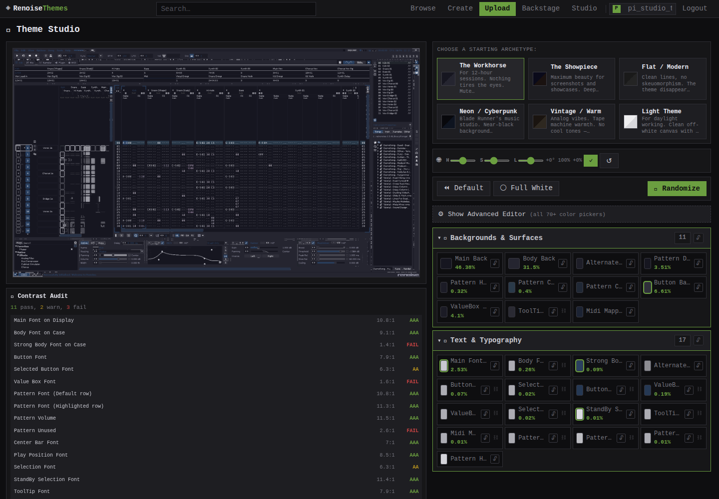
Step 1: Pick an Archetype
Six archetypes provide a starting palette tuned to a specific visual mood:
| Archetype | Vibe | Character |
|---|---|---|
| Workhorse | Daily driver | Muted blue-grey backgrounds, high contrast text, subtle accent. Comfortable for long sessions. |
| Cyberpunk | Neon-drenched | Deep purple-black base, cyan highlights, hot magenta accents. Blade Runner's tracker. |
| Forest | Organic calm | Dark olive greens, warm cream text, muted sage accents. Natural and easy on the eyes. |
| Sunset | Warm & inviting | Deep amber-brown backgrounds, golden text, orange-red highlights. |
| Midnight | Minimal dark | Near-black base, cool blue-white text, restrained blue accents. Purely functional. |
| Paper | Light mode | Off-white backgrounds, dark navy text, subtle sepia highlights. Daytime use. |
Click any archetype card to instantly seed all 70+ elements with a cohesive palette. The preview updates in real-time.
Step 2: Use Smart Fill
Changed a few colors but the rest look disconnected? Hit 🎲 Smart Fill. The algorithm:
- Identifies your locked (pinned) colors as anchors
- Fills unlocked elements using role-appropriate HSL ranges
- Propagates font colors through tracker columns with hue offsets
- Ensures minimum contrast ratios between backgrounds and text
Step 3: Read the Contrast Audit
Below the preview, a live Contrast Audit panel shows every font-vs-background pair in the UI with WCAG grades:
- AAA — Excellent contrast
- AA — Acceptable
- FAIL — Needs attention
Click any row to jump directly to that element's color picker. The Design Traps panel warns about common mistakes: silent selections, invisible scrollbars, and muddied selection states.
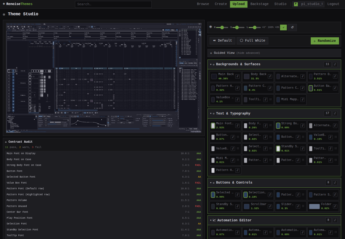
Step 4: Tweak with Global HSL
The 🌐 Global HSL slider lets you shift the entire theme's hue, saturation, and lightness at once. Want to see your cyberpunk theme shifted toward warm tones? Slide Hue to +60° and hit ✓.
Step 5: Go Advanced
Ready for granular control? Click ⚙️ Show Advanced Editor to reveal all 70+ color pickers organized by UI group. You can still use Smart Fill, the audit panel, and global HSL — they all work in advanced mode too.
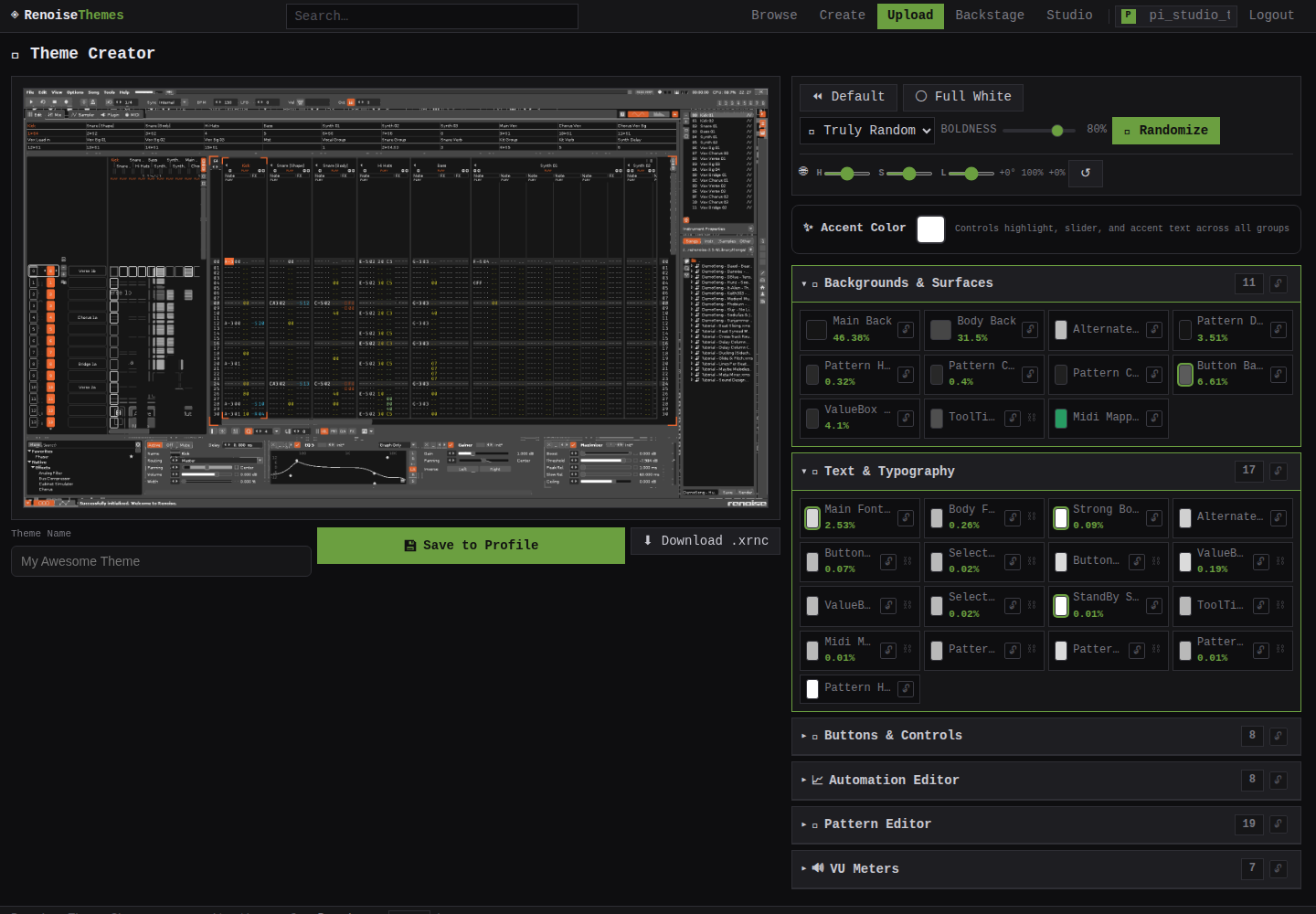
Advanced Editor — Full Control
The Advanced Editor (/create) gives you direct access to every Renoise UI element, organized into logical groups:
Element Groups
| Group | Elements | What It Controls |
|---|---|---|
| Backgrounds | 11 | Main_Back, Body_Back, Pattern areas — 46%+ of screen |
| Text & Typography | 17 | All fonts including tracker column text |
| Buttons & Controls | 8 | Buttons, selections, scrollbars, sliders |
| Automation Editor | 8 | Automation curves, markers, grid |
| Pattern Editor | 19 | Tracker note data, play position, mute states |
| VU Meters | 7 | Level meters with preset themes |
Each color picker shows the element's pixel coverage percentage — how much of the screen it affects. The top 10 elements control 97.9% of the visible UI.
Palette Generator
The 🎲 Randomize button generates complete palettes using four color relation modes:
| Mode | Behavior |
|---|---|
| Truly Random | Complete chaos — every element gets an independent random color. Fun but rarely usable. |
| Same Hue | All elements share a single hue, varying only in saturation and lightness. Produces monochromatic themes. |
| Bi Opposite | Two opposing hues — backgrounds/UI use one, accents use the complementary hue. High visual interest. |
| Triadic | Three evenly-spaced hues — background, UI, and accents each get their own. Maximum color variety while staying harmonious. |
The Boldness slider (0–100%) controls how aggressively the palette departs from safe, conservative ranges. At 100%, colors are vivid and high-contrast. At 0%, they stay subtle and muted.
Master/Slave Linking
Some elements are linked — changing Main_Back also updates Body_Back and Alternate_Main_Back. Linked elements show a ⛓️ indicator. Master elements (👑) control their slaves. You can unlink pairs individually if you want independent control.
VU Meter Presets
Instead of picking 5 VU meter colors manually, choose a preset from the dropdown row. Each preset sets the full gradient from low (green/yellow) through middle to high (red/peak).
Saving & Exporting
When you're happy with your design:
- 💾 Save to Profile — Saves the theme to your Backstage. Draft by default; publish when ready.
- ⬇ Download .xrnc — Generates a valid Renoise theme file. Drop it into
~/.config/Renoise/V3.x/Themes/and restart Renoise.
Draft themes are visible only to you on your Backstage. Hit Publish to make them visible in the public gallery.
Keyboard Shortcuts
| Key | Action |
|---|---|
/ | Focus search on browse page |
↑ ↓ | Navigate theme grid |
Enter | Open selected theme |
Esc | Close lightbox / color wheel |
Need the technical details? Read the full technical overview of the pixel map system, rendering pipeline, and automation tools.